Fun With Adding Color in a Graduated Filter
This is more of a fun experiment to see what you can do than a thing you must do, so enter in with the spirit of play and exploration. It all started when I was doing one thing, then started to wonder about doing this other thing, and then the next thing you know I thought, hey, this is kinda cool. So, what am I talking about, exactly? Good question. Grab a photo with a dominant color and play along.
Step One: With photo selected, press the M key to switch to the Graduated Filter tool in Develop.
Step Two: Click somewhere off to the side of your photo and drag away from the photo (just a little) to drop the pin for that adjustment. Your entire photo should be getting the full effect of the Graduated Filter.
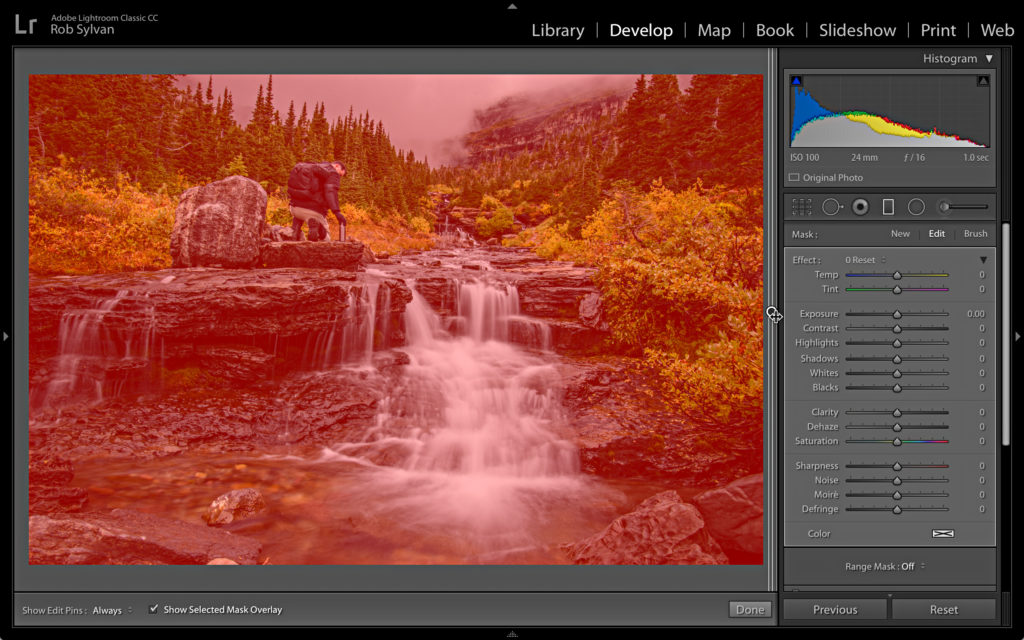
Step Three: Double-click the Effect label at the top of the panel to reset all settings in the filter.
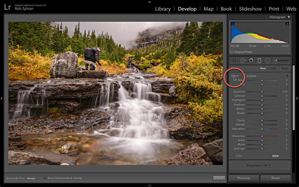
Step Four: Click the Color swatch at the bottom to open the Color Picker.
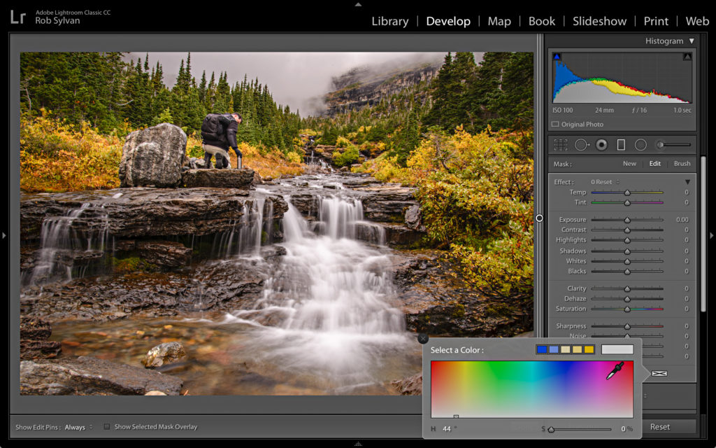
Step Five: Now here is the tricky part, with the eyedropper, click into the Color Picker and drag the tool out into the photo to sample color from the photo. As you click-drag into the photo the tool will sample whatever color is under the eyedropper. Choose the dominant color in the image.
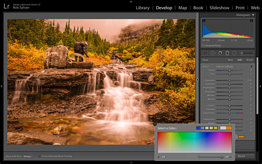
Step Six: It is probably oversaturated as heck, so grab the Saturation slider within the Color Picker and turn that down to a reasonable level. Close the Color Picker by clicking the X on the left corner or just clicking outside the box.
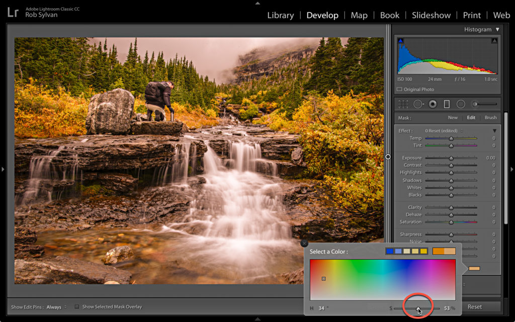
Step Seven: Now give the little light switch at the bottom-left of the panel a flick up and down a few times to turn off/on the effect to see how it looks. Go back and adjust the saturation level (or pick another color) if needed.
Step Eight: This is where you bring it home. Click the Range Mask drop-down menu and choose Luminance to refine the look further. Adjust the Range sliders so that you are only affecting the darker tones (left side), then the brighter tones (right side), and then the mid-tones by clicking in the center of the handles and dragging the entire range left and right. This gives you a whole new level of control over where your color overlay affects your photo, and you can decide what looks best for a given photo (if at all). You can always go back and readjust the Saturation slider as needed.
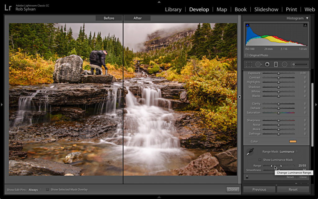
Now that you know the basics, experiment, play, and see what more you can do with that same effect through the Radial Filter or Adjustment Brush. Then try adding in other sliders for different results. I think it is pretty neat!

One other tip: If you put your mouse in the colour picker box you can click and drag anywhere on the screen and sample a colour from there. That means you can grab a colour from your image, but if Lr is running in a window, you can slide over and grab a colour from anywhere else on the screen as well.
Also, while they’re generally used for colour toning B&W images, you can use the split toning sliders to add colour overtones to colour images as well. Again you can use the same tip when selecting colours for the shadows and highlights sliders. You can adjust colours using the point curves as well, but that requires a little more understanding of colour theory.
Very cool thanks
hello Rob,
thanks you for the tip.
This is also a great technique to make local HSL waiting for the local tool all LR users are waiting for (see adobe suggestion forum).
Moreover we can use the brush to paint out the effect at some locations.
It is tedious to address pins outside the image when you have several ones (ie: one by color enhancement) but a great tool to compensate for weakness of lightroom with respect to ON1 photoraw 🙂
best regards
marc
This is great!!! Just like Split Tone for Midtones!!! I noticed that you can darken and lighten the image as well.
Also, is this “Saturation” slider the same as the “Saturation slider in the Basic Panel? If yes, should we request a Vibrancy slider from Adobe?
The Saturation slider I am referring to is the one inside the color picker that controls the saturation of the selected color.
Thank you for clarifying which one, but wouldn’t it be nice to change all 3 – HSL using the filters/brush?
Yes, but in the context of this tutorial we’re adding a color to the Graduated Filter, and using the Color Picker to choose that color (and the Saturation slider helps us fine tune that color). This is not a tutorial about changing Saturation or Vibrance of the image or necessarily changing the individual colors of the photo (although they are affected by the color overlay).
So, yes, it would be nice to have a sort of HSL adjustment avail in the local adjustments, but that’s not what this is about is all.
Hey Rob,
Thanks for this tutorial!!! I’m going to give it a try! Looks like a lot of fun … and experimentation, which I love to try and do!
Thanks,
Dennis
You’re welcome!