
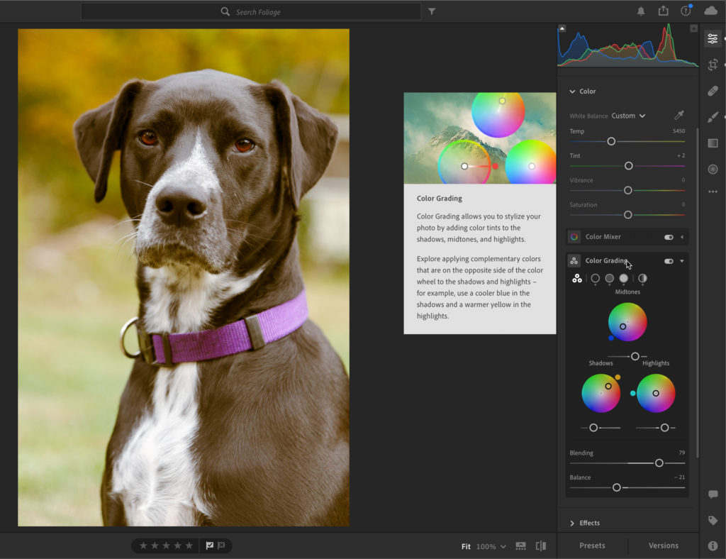
Introducing Color Grading
With the October 2020 updates to Lightroom Classic, Lightroom, and Adobe Camera Raw we saw the addition of the new Color Grading panel. Color Grading is a replacement and improvement over the old Split Toning panel. In this article we’re going to look at it in Lightroom Classic, but it functions essentially the same way in all the apps I just mentioned.
Replacing Split Toning
With Split Toning you could add a tint into the shadows and/or highlights of an image for creative or corrective effects. Color Grading does all of that, plus it allows the addition of a tint into the midtones as well. Even more, we can also adjust luminance within each range of tonal values. Aside from the ability to add tint into shadows, midtones, and highlights you can also add a tint globally as well. These additional controls provide an amazing array of creative and corrective possibilities. So, say goodbye to the Split Toning panel, and say hello to Color Grading.
Note, in the Lightroom apps you’ll need to expand the Color panel to find the Color Grading panel nested inside (as shown here in the Lightroom for desktop app).
But wait, what about all of my pre-existing presets that contain Split Toning adjustments, you might wonder? Those all still work with Color Grading. If you apply an old preset with Split Toning you’ll see the preset settings applied to Highlights and Shadows (as configured in the preset), Midtones wil be zeroed out, and the Blending slider will be set at 100 to mimic the same look provided by the Split Toning panel. Let’s get more oriented to the Color Grading panel.
The Color Grading Panel
The buttons at the top of the panel provide control over how the contents of the panel are displayed. The first button of three circles takes you to the default view of seeing all three color wheels (note, due to the smaller screen, the mobile apps don’t have this view). Clicking any of the next three buttons (circles) will zoom the view to just the color wheel and controls for Shadows, Midtones, or Highlights respectively. The button on the far-right side is for viewing the Global tint color wheel and controls.
In the center of the panel, by default, are three color wheels for choosing a tint to apply to Midtones, Shadows, or Highlights as labeled. In this view, below each color wheel is a Luminance slider for adjusting the brightness of each range. One way to select a hue is to simply click into a color wheel and drag around within the wheel until finding a desired hue and saturation you prefer. Dragging around the wheel changes the hue, while moving from the edge toward the center reduces saturation. It is very what-you-see-is-what-you-get, but we’ll explore some other options for choosing a tint later on.
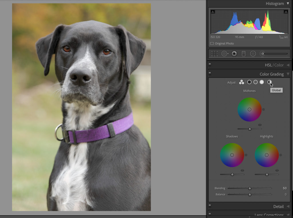
At the bottom of the panel are sliders for Blending and Balance. The Blending slider controls how much mixing of tint happens between the tonal ranges. For example, if you were to apply an old Split Toning preset you would see the Blending slider move to 100 to have the maximum amount of mixing of Shadow and Highlight tints (any existing midtone tint would also be removed as that is not included in Split Toning presets). If the Blending slider was then reduced to 0 the mixing of tints would stop.
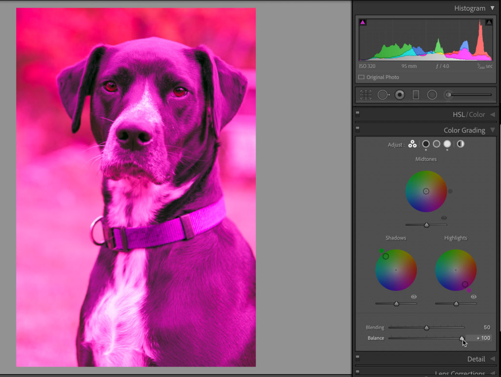
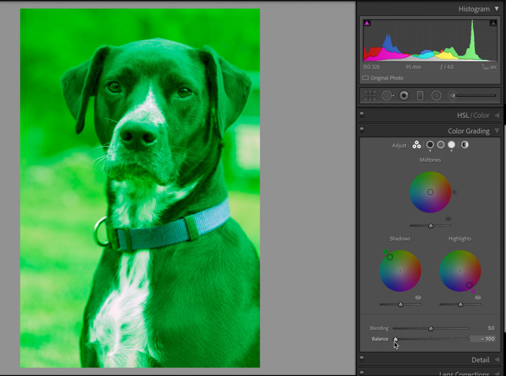
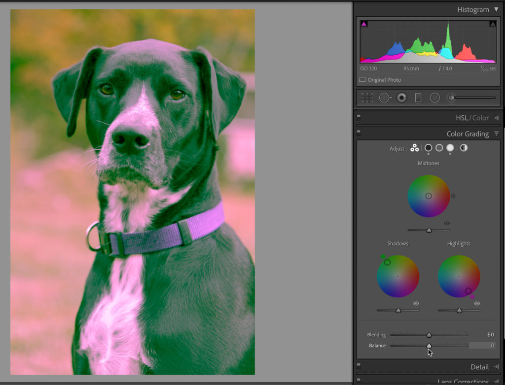
The Balance slider can be used to shift what pixels are considered Shadows or Highlights for tinting purposes. At the extremes, setting Balance to 100 forces the Highlight tint across almost all pixels in the image, while setting Balance to -100 forces the Shadow tint across almost all pixels in the image. Let’s look at an extreme example, where I applied a very saturated magenta tint to the Highlights and a very saturated green tint to the Shadows:
Balance at 100 shows the magenta tint applied to the Highlights across entire photo.
Balance at -100 shows the green tint applied to the Shadows across entire photo.
Even adjusting the Blending slider to increase or decrease mixing will have minimal affect when Balance is at the extreme ends. But if I put the Balance slider at the default of 0, then we can see both tints applied to the highlights and shadows within the photo.
These controls deserve a lot of experimentation and observation to get a feel for how they work independently and together. Luckily, it is pretty fun to play with, and the results are updated live as you adjust. I recommend placing a different and discrete high saturation color into the shadows, highlights, and midtones, and then experiment with the Blending and Balance sliders to see how they work together. I’ll double-click the word Adjust at the top of the panel to reset the entire panel and remove all color grading, so we can explore it further.
New Color Grading Presets
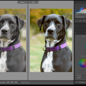
I always think it is worth experimenting with the presets that are included in the software. You may not like the final looks, but they can still be instructive for learning a new tool. If you expand the built-in Creative preset group there are three new presets for Color Grading, which are called Cool Matte, Cool Shadows & Warm Highlights, and Warm & Moody. Note, these presets contain other panel settings too, but I’m just focusing on how Color Grading is used.
You can hover your cursor over each one to see how they affect the selected photo, but with Lightroom Classic you need to click on one to see its settings (though on Lightroom for Mac/Win just hovering your cursor over the preset shows the settings in the panel too). For example, clicking the Cool Matte preset applies a different blueish tint to the Shadows and Midtones respectively, a yellowish-green tint to the Highlights, leaves Blending at the default of 50, and sets Balance at +21 to increase the range of what tones are considered Highlights, which increases the prominence of the Highlights tint.
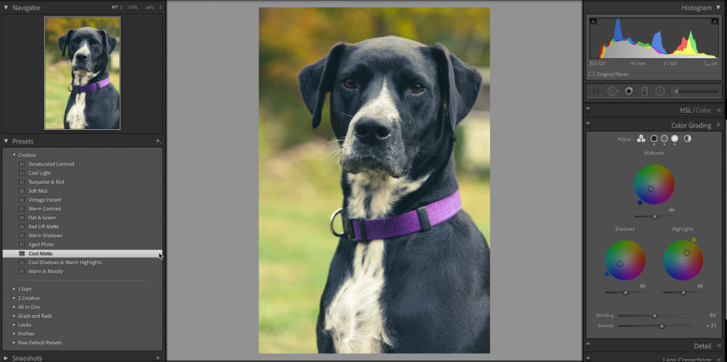
It is worth noticing that you can see a small dot appear under each circle along the top of the panel representing the different color wheels that have a tint applied. You can also click and hold the eye icon under each respective color wheel to turn off the tint from that color wheel and see a before and after view of how each tint affects the photo.
Come back and join me next week as we explore more ways to use this exciting new panel. In the meantime, go experiment on your own and have fun!
Do you know of a way to get back to the old Split Toning panel?
Not without rolling back to the previous version of LrC. Color Grading should be able to do all Split Toning can do and more. What do you need that you can’t do with Color Grading?
Now give us whatever Adobe calls their Lumetri Scope now for horizontal display of the luminance and color values overlaid/concurrently from L-R in the image. Much faster to see where colorization effects show up on the actual image. Make it tear-off and float too please 🙂 I use resolve, but Adobe has these tools to help in video color grading, should be simple to port across for static photo evaluation with dynamic update as you change color wheel values. It could take the place, or be an option to display vs the histogram as well.