Remember when HDR images all pretty much looked like this?
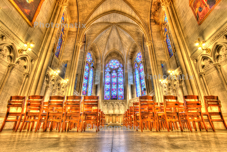
I had to go download a trial copy of Photomatix Pro 6 to get this classic look (ahem), that we saw so often at the birth of HDR photography.
Oh wait, I forgot the heavy Vignette.
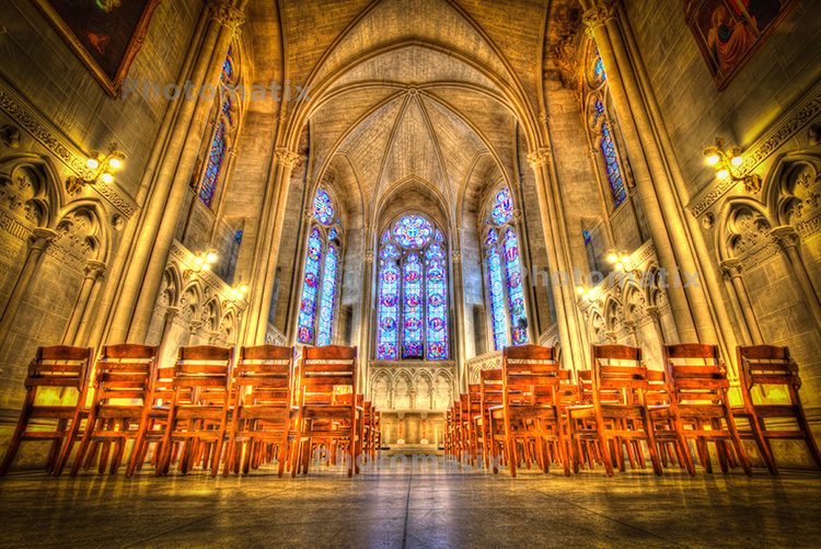
Today, HDR (processed in Lightroom) looks like this (below):
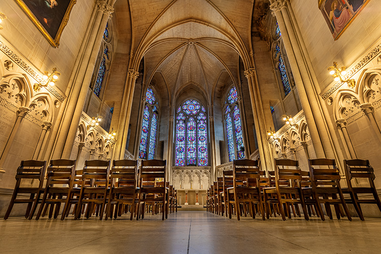
Even Photomatix Pro 6 now has a bunch of presets that look more realistic and normal (though sadly they did keep some presets like the one you see up top, and worse, so -5 points on them. Just remember; just because the
The Damage Has Been Done
As a presenter teaching live seminars, when I say the word “HDR” in front of a crowd of photographers, the image at the top of this post is what instantly pops up in photographer’s minds, and you can literally see people in the crowd making faces like they’re smelling the inside of a wooden leg. That’s because they’re picturing that overly vibrant, Harry-Potter-
But HDR has changed.
Now it’s back to what I think it was first intended to be, which is a way for us to have our cameras capture and record a wider tonal range than today’s sensor’s can manage. It’s the shot of a cathedral where the stained glass windows are no longer blown out to solid white, but have their full color, depth, and dimension. Landscapes, interiors, architecture, and many more genres will have us doing
How Do We Change That Initial Reaction?
I’d love to see us get to a place where when we mention HDR it doesn’t automatically elicit a negative response from photographers. I know that today, every time someone does one of those over-the-top HDR images, God kills a kitten, but that’s not enough.
I’m hoping that the more people try Lightroom’s built-in HDR, the more they’ll realize the benefits of that expanded tonal range (like we talked about here last Friday), and that at some point we’ll get past the past. I’d love to see us see HDR as an awesome tool that makes our photos more realistic, with a wider range of editing available to us without adding noise and damaging the image.
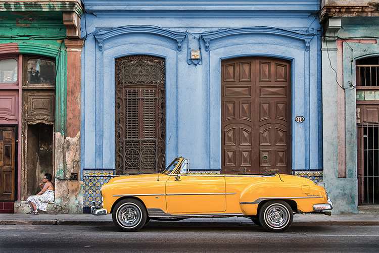
So, what I guess I’m asking is; the next time you hear the term HDR, and you immediately conjure up something like this HDR image…
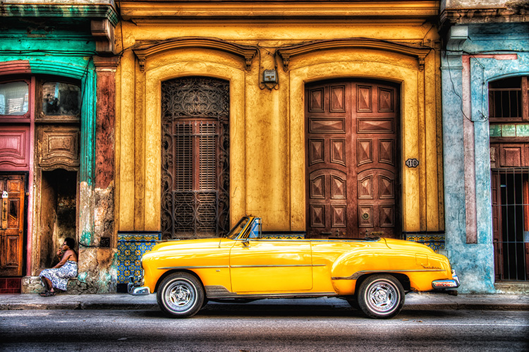
…instead, try to mentally replace it with this HDR image (below):
Stepping off my soapbox now. 🙂
Here’s wishing you at least a semi-realistic day! 🙂
-Scott
P.S. Ready to go to Vegas? If you missed out on Photoshop World in Orlando, you don’t have to miss out again. August 21-23 at the Mirage — we’re bringing the big show!! Plus, on the Lightroom track you’ve got me, Rob, Serge Ramelli, Matt Kloskowski, Terry White, Kristy Sherk and the best of the best. Sign up today and save a bundle! PhotoshopWorld.com


Gawd! I’ve seen so many garish cartoonish looking attempts at HDR processing over the years, it’s frightening. Thankfully the fad has moved along. I definitely agree, looking at the LR processing image it’s far more pleasing to the eye. That being said, I haven’t even attempted to process as typical HDR (Photomatix-LR etc) in over 8 years. Instead, I’ve learned and mastered manually blending bracketed exposures only as needed during post. It’s manually intensive for sure, but the results are natural
I so agree and remember the defense of those looks by aficionados at the time… almost shouting down our impassioned pleas of “YUK!” (well, some of them yuk). I’m finding I need to add a curve or pull the black point down and a white point up a bit to get the contrast to seem more realistic using the LR HDR version – it’s just a bit too constrained into the middle. 2 nice shots there Scotty.
I find that upping the clarity and texture helps take care of the mid tone contrast.
Lightroom has become my go to HRD processor. Like like the new look of normal saturation.
none of them, including your improved versions, look like photographs, they all look like paintings. No thanks.
Call it ‘Extended Tonal Range” instead of HDR or some such different name just to add to the confusion and make people look at the new way of doing things.
There are many ways to produce an image that that looks awful HDR is just one. Used properly though HDR can improve an image