
Cool 6-up Lightroom Layout
Don’t just think of this as a layout for print — you can save this layout as a regular JPEG and share it online just as easily. NOTE: This is a Lightroom Classic tutorial only. The Print Module, and printing of any kind, do not exist in the cloud-storage version of Lightroom).
Here’s how it’s done:
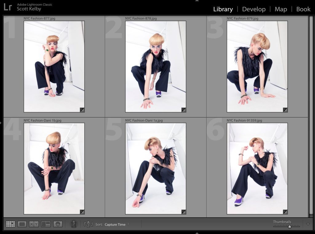
STEP ONE: Put the images you want in your layout into a collection (you’ll see why in just a minute it’s helpful to have them in a collection).
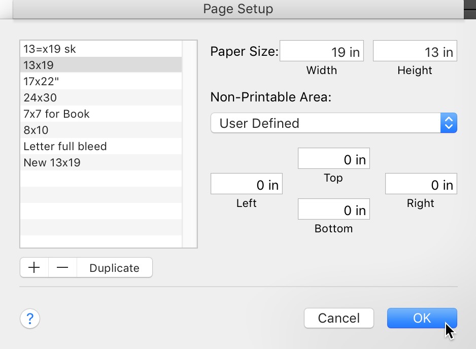
STEP TWO: At the bottom of the left side panels, click on Page Set-up. This is where you choose your paper size. Here I created a 13×19″ wide page (this is a super popular size for photography prints, so this is all based on you using this size paper. If you choose a different size, you’ll just have to tweak the settings I’m going to give you in a moment to fit your paper).
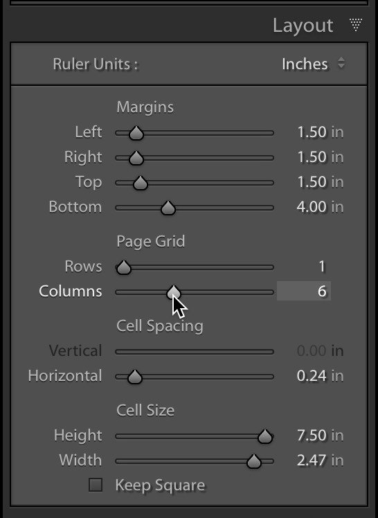
STEP THREE: In the Print Module, go to the Layout panel. Set up your margins for how much white space you want around your images. In this case, add 1-1/2 inches on the Top, Left, and Right, and leave 4″ of white space at the bottom so you can add some text under your images. Under Page Grid I set it to 1 row and 6 Columns (as seen above). Set your spacing around 1/4 inch. Your Cell height to 7.5 and width to 2.47. Basically, just enter the settings you see in that panel which work perfectly for a 13×19″ wide page.
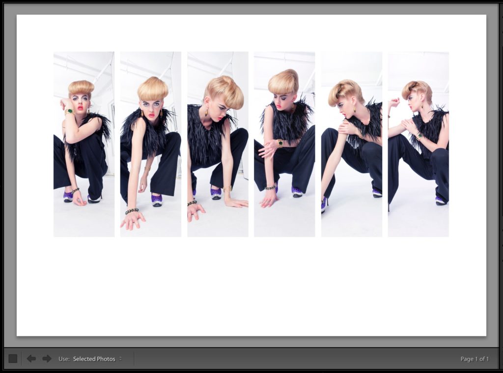
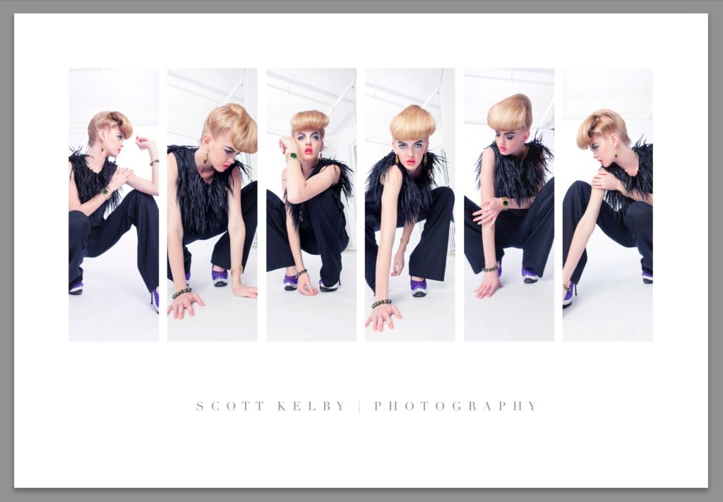
STEP FOUR: This is what your layout should look like if you input those exact settings. If it doesn’t look like this, double-check your numbers. Now, there is a tweak we could make from a design standpoint that would make our layout stronger. Ideally, you want all your images “looking in” toward the image (you don’t want anyone looking off the page). While no one’s looking away in this shot, if you moved either the 5th or 6th image from the left to the first position (making it the first image), and then flipped it, you’d have her looking inward on both ends. This will make more sense in just a moment. Let’s roll on.
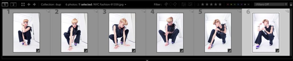
STEP FIVE: Here’s where it’s nice to have your images in a Collection — you can just drag and drop them into any order you’d like. Make your Filmstrip visible along the bottom of the window, and click on the 6th image (as seen above). You’re going to drag that image down to the #1 position).
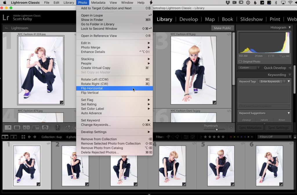
STEP SIX: Once you drag that 6th image over to the first position, you can see she’ll be looking off the page. So, click on that 1st image, go under the Photo menu and choose ‘Flip Horizontal” as shown here to flip the image so he’s facing the other images in the layout. I know this sounds like a little picky thing, but it actually does make for a stronger layout (this is from my days as a full-time graphic designer).
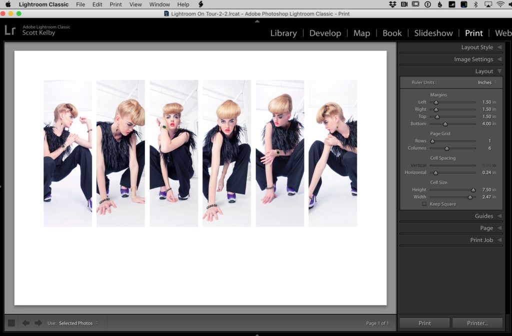
STEP SEVEN: Now you can see more clearly what I mean — see how both ends (positions #1 and #6) are facing in toward the rest of the images and the center of the page. Ahhhhh, that’s better. Also, you can on each individual photo and drag it left or right inside it’s “cell” to position it so the part of the image you want to be seen is there.
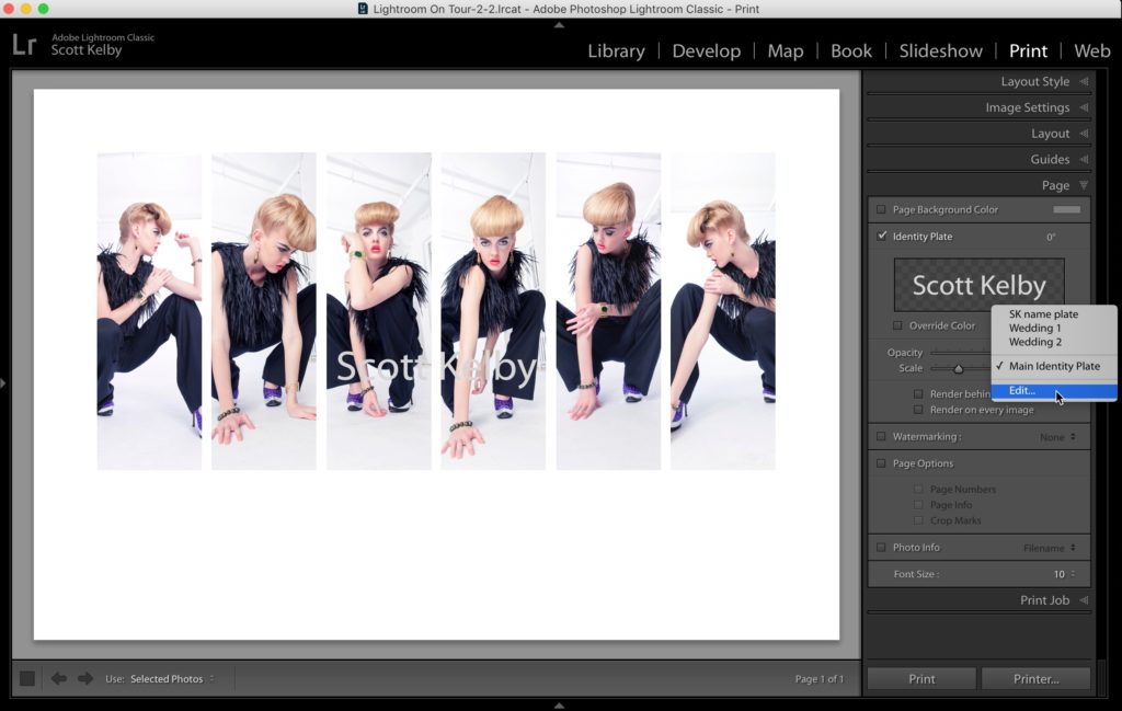
STEP EIGHT: To add our text, in the Print Module go to the Page panel, and turn on the checkbox for Identity Plate. It will now display your name in the center of all the photos, usually using the boring font it can dream up. You can customize this text by clicking on the little down-facing arrow in the bottom right corner of where your name appears inside the Page panel, and it brings up a pop-up menu (shown above right). From that menu, choose Edit as seen above).
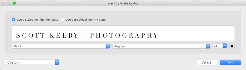
STEP NINE: This brings up the Identity Plate Editor window. This is a super lame place to edit text but it’s all we have. Now type in whatever text you want, and you can highlight your text and even choose different fonts for different words (in this case, I usually a “fashiony” font called Didot, but if you have Bodoni Poster, it will do as well). There is no control for tracking, kerning, etc., so to add space between the letters, I simply hit the space bar once between each letter. I know what you’re thinking, “Aren’t Adobe the people who brought digital type to the world like 30-something years ago? Can’t they do better than this?” Well, that’s what I think every time I’m in this window. I can’t think of any other application on earth that has more limited text controls than this window. But I digress.
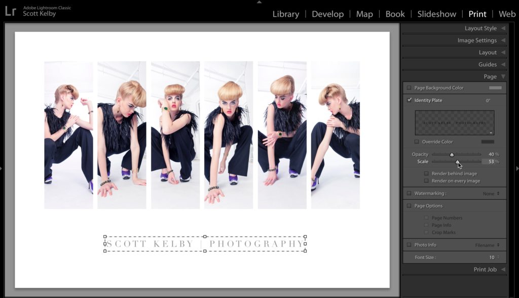
STEP TEN: Once you click OK, your text in the center of your image gets updated, but it’s still right over your photos, so click within its bounding box and drag it down into position under the image. There’s no way to automatically center your text, so you just have to “eye it.” This would be another ideal opportunity for me to whine about the POOR text capabilities of Lightroom, but let’s just pretend it’s not as embarrassingly bad as is it and just move on to the next step. Sigh.
STEP 11: Once I saw how my text looked on the page, I felt it didn’t have enough spacing between the letters so I went back to the Identity Plate Editor window and put another spacebar hit between each letter to add more spacing. Then I lowered the Opacity (in the Page Panel), and I make the type a little smaller using the Scale slider, also in the Page panel). One last thing (coming up).
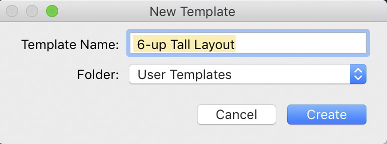
STEP 12: If you like this layout and want to use it again without having to recreate it all from scratch, I recommend going over to the Left Side panels to the Templates panel; click the little + sign icon to save this layout as a custom template. This will bring up the New Template window (shown above) where you can name your template (a very descriptive name helps), and then click ‘Create’ and now this template will appear under your User Templates in the Templates panel.
Well, there ya have it. Hope you found that helpful.
Here’s to what I’m hoping for you (and me) will be an awesome week! 🙂
-Scott

So the 2nd from left – the head looks too large compared to those on either side – how do you scale just that one image slot down a bit to balance it out ? (trick question, right up there with the text thingy…) It’s a nice tutorial scott 🙂
You’d have to crop it (or the others depending on what you want to do).
I made Virtual Copies and re-sized them in my instance…
Great tutorial Scott. Love these kind of print template lessons.
Thanks, David 🙂
I do not see or find the Lightroom Panel you mention in the Print Module. I have latest update of Lightroom Classic. I have all the panels showing on the right side of the screen but do not see where to set your Left, Right, Top, Bottom dimensions. I don’t see Rows and Columns and The vertical and Horizontal do not permit me to get to0.0. Sooo, I am doing something wrong. I really want to try this print. Please guide me.
Make sure you are using the Single Image / Contact Sheet layout style.
When you are in the Lightroom Print module, look for the Page Setup… button next to the Print Settings… button at the bottom of the left side panels. Click the Page Setup… button and the simple Page Setup window will appear. Click on the Paper Size drop-down menu bar and at the bottom of the paper sizes list you will see the Manage Custom Sizes…option. Choose it and more options will appear allowing you to make a custom page size with specific margins as well, just like the screenshot right above STEP TWO in the article above. Hope this helps, Joe.
This was a great tutorial. Thanks –
You bet, Dudley 🙂