
How to replace the words “Adobe Photoshop Lightroom Classic” with your own logo (or text)
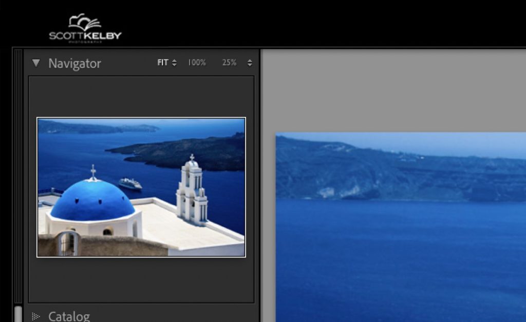
Here’s a quick way to replace the default text that appears up in the top left corner of your Lightroom Classic window with either your own custom text, or even your logo.

OK, now that you know what we’re shooting for, let’s do this:
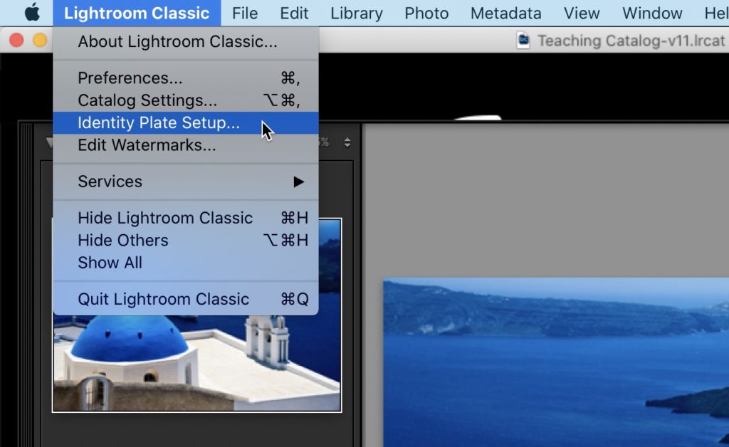
STEP ONE: On a Mac, you’d go under the “Lightroom Classic menu” ( as seen above) and choose ‘Identity Plate Setup…’ or on a Windows PC this would be under the Edit menu.
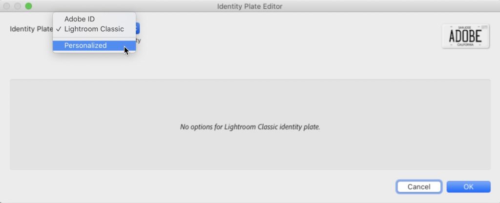
STEP TWO: This brings up the Identity Plate Editor window you see above. In the top left corner, from the pop-up menu choose Personalized (as seen here).
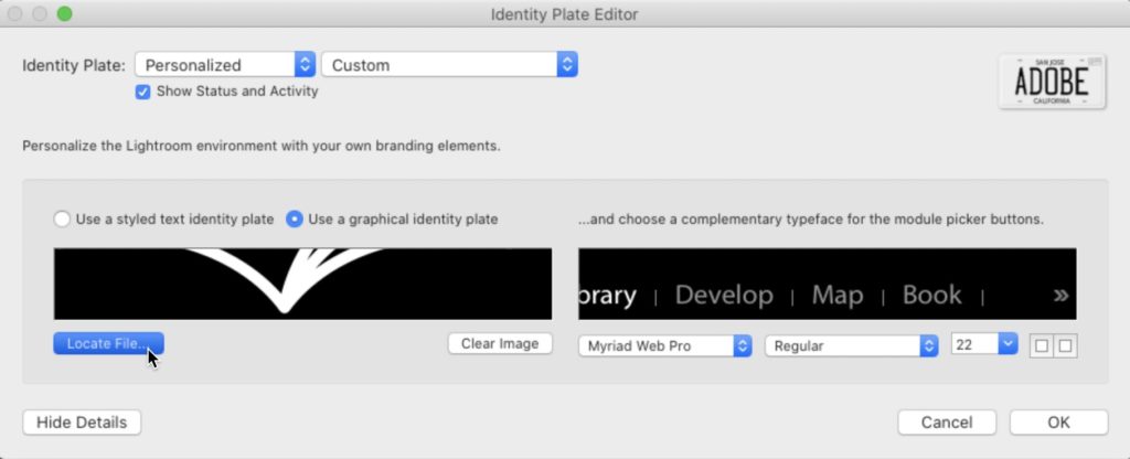
Then below that, you have two choices for replacing the Lightroom logo with your own custom logo. One is to just type in the name of your studio (this the default choice), but if you click the button to the right of that choice, the one called “Use a graphical identity plate” (as seen here), then you can either click the “Locate File” button and navigate to wherever you keep your logo on your computer, or just drag and drop that image into the black rectangle on the left side (right under the two buttons). That’s it. Click OK — boom — you’re done. Now your logo will appear in that upper left corner.
TIP: Lightroom’s interface is solid black up there, so if you want your logo to blend in, you need to either:
(a) Put your logo on a black background before you bring it in to Lightroom this way, or
(b) Put your logo on a transparent background in Photoshop (put your logo on a transparent layer, then delete the background layer in Photoshop and save the file in .png format, which is a format that maintains transparency when you import it into Lightroom). I did a tutorial a few years back on how to do this transparent logo – here’s the link.
NOTE: What size should you make your graphic? No more than 41 pixels high, and I made my 200 pixels wide, but if your logo looks good in a wide format, you can go wider, as long as you don’t go deeper than 41 pixels.
Hope you found that little tip helpful. Have a great weekend, y’all. Stay safe. 🙂
-Scott
P.S. Over on my other blog today I did a post on where I go to shoot travel photography if suddenly all this COVID stuff was completely behind us. Here’s the link if you’ve got a sec.