He Dumped ‘Cloud’ And Went Back To Classic. Here’s Why (and one thing that could help)
The UK’s “Digital Camera World” site is one of my favorite photography sites, and this past week I ran across this post from a Lightroom user who had switched from Classic to LR ‘cloud’ and came running back to Classic.
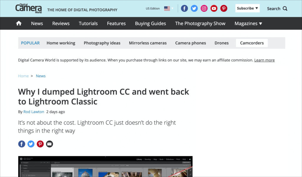
He does a point-by-point list of what Lightroom ‘cloud’ still doesn’t do, with missing features like not having Smart Collections to Virtual Copies (though he left a bunch off his list). Here’s the link if you want to give it a read.
I agree with his reasoning in the post (and I have even more reasons than he listed), but one thing emphasized in the post really struck a chord with me, when he wrote:
“Well, I’m torn. I LOVE the Lightroom CC [cloud] interface compared to the creaky relic that is Lightroom Classic. If only I could have both! But the fact is, Lightroom CC just doesn’t work for me.”
—ROD LAWTON, Digital camera world
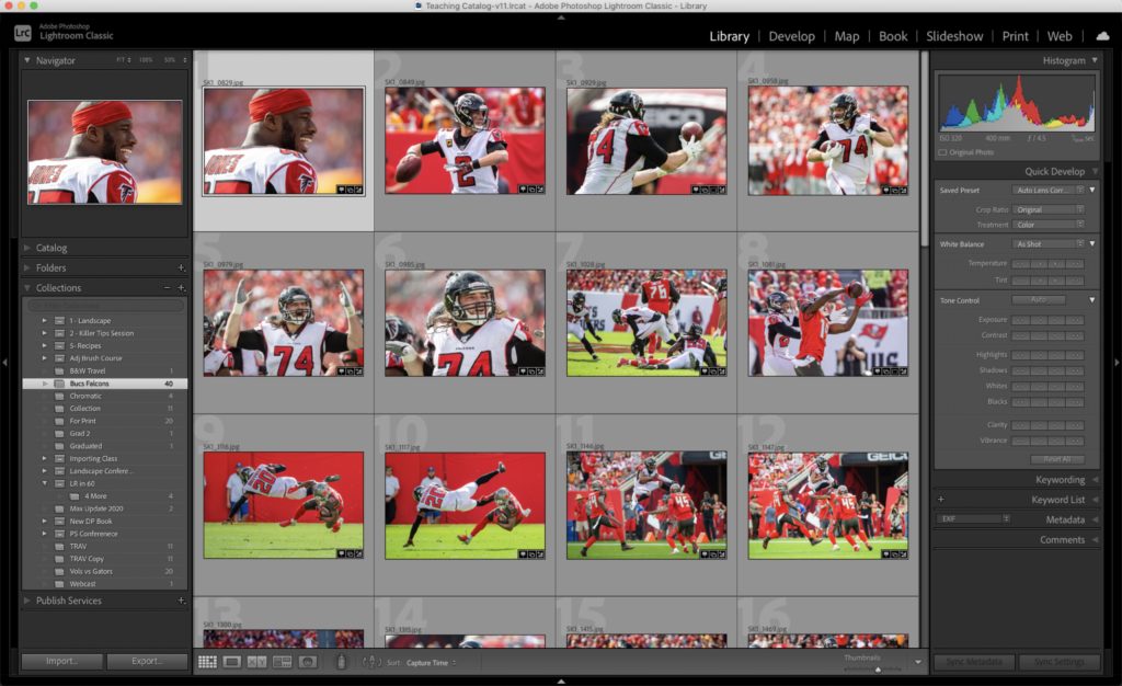
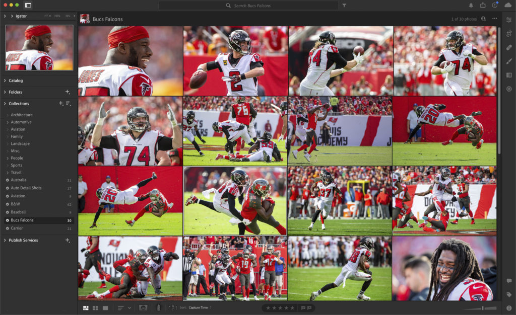
Man, he’s got a real point on that interface. Why can’t we have both? The look (interface) of Classic is very much the same as it was when it launched almost 14 years ago. The ‘cloud’ version of Lightroom has a much more modern and streamlined interface, which Adobe could easily apply to Classic.
Now, don’t rush to the comments and post “It’s because Adobe doesn’t care about Classic” because you’ve been saying that since 2017, yet Adobe keeps adding lots of new features and improving Lightroom Classic year after year, yet this one low-hanging fruit still hasn’t been updated, and by seriously Adobe, it’s time! In fact, it’s LONG overdue! (NOTE: of course, bug fixes and problems with releases are expected to be fixed by Adobe — I’m not talking about that stuff — this is when it’s time for NEW features to be added).
What might Classic look like if they did update its look?
I show in the first capture (below) how Classic looks today, and then below it I applied the cosmetic changes from LR ‘cloud’ to Classic just to see what it might look like, and I have to say — it does look much more modern and fresh.
Now let’s do the same thing to Lightroom Develop module — with its two-sided panels and filmstrip along the bottom and update it with the Edit space look from LR ‘cloud’
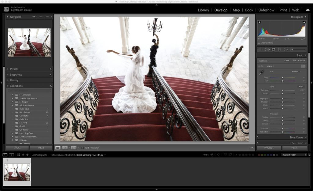
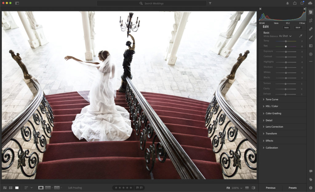
Again, it’s a cleaner, more modern look, and a lot of it is simply changing the fonts, the arrow before the panel’s name, and the shades of gray. Doesn’t seem like that’s too much to ask, and like he says, “Why can’t we have both?” (the features of Classic with the updated look of LR ‘cloud’)?
Let me know what you think in the comments below, both on his comments, and on this interface tweaking I’ve done above.
Hope you all have a rockin’ week, a safe and happy one, too!
-Scott
P.S. Today over on my daily scottkelby.com blog we officially announced the Wildlife Photography Conference coming March 16-17, 2021 that I’ve already sneeked to you guys here in LRkillertips. Here’s the link if you’ve got a sec.



I wish they can offer an option of choosing any of the two, while keeping the same features. So we can have our cake, and eat it too.
“Why can’t we have both?”
Because Adobe does not care about photographers. They care about money. And Lightroom CC makes them inconceivably more money.
I think that Adobe must take consideration also the newcomers like me that started very recentely working with Lightroom Classic.
After months I have still problems for identifying the controls, the panels, where I am while working etc. and so the last thing desired is the change in the interface and layout.
I like the current interface for LR Classic. Perhaps a few changes are in order, but any radical changes would probably just frustrate me while learning them. What LR Classic needs most is some of the better features of Photoshop such as the Spot Healing Brush. Another useful update would be to allow multiple catalogs to be open at once with tabs for switching. Another huge improvement would be to see an unlimited number of Keywords in the Keyword List. Finally, LR Classic has had a bug for quite some time where if you’re doing a lot of multiple selects and adding keywords, over time the program slows, then begins to blink off and back on, then finally crashes. I have found that if I close and reopen LR Classic at the blinking stage I can reset the process. However, this is frustrating and needs to be fixed.
I think that the interface is perfect as is. I really wish that you could search and choose more than one collection on import. Why should I have to remember to drag to a 2nd collection.
Also, if you have photos on a card and then import new ones, and uncheck them, they really get too dark.
Now would be a good time to do it as well, since they need to overhaul the code to make an M1-native version of Lightroom Classic. It would do Lightroom Classic wonders. My only question would be if it would introduce more user confusion, since you still need Lightroom CC for certain things such as syncing presets to mobile, etc.
I’d be lying if I said I didn’t want to have a more unified version (essentially a Lightroom Desktop that is a merged version of Lightroom CC and Lightroom Classic). Adding the ability to selectively sync RAW images, presets, Smart Collections and Virtual Copies would take it a huge step forward. But even an updated UI would be welcome!
Sometimes change is good … sometimes it a real pain. Like using ACR and then using LR Classic. Same engine, but different interface. Personally I like the LR Classic look and I’ve been using it since version 1!!! I use ACR a lot too, but I can’t stand how the changed all the menu buttons … doesn’t work for me. That said … you can beat LR and ACR for the RAW image processing!!!
Dennis
I am really happy with the cloud version. But there are 2 things missing for me. The custom naming at export are still not as good as in Classic. The biggest thing for me is the missing book module! Are there any hints that this is comming to cloud?
Honestly, I doubt it. No insider info there, I just doubt that it, or tethering or even a robust print module will ever make it there.
I really hate the way that program interfaces are continually changed in the name of progress, when all they do is ‘move the cheese’ and make it more diifficult to find waht I’m looking for. Please Adobe keep the Classic look the same!
I seem to remember, way back when, Adobe did come up with an updated interface that resembled the current Cloud interface and the Lightroom community went crazy, wanting the old interface back.
Anyone remember that?
Jim
Yeah, that was when they surprised everyone with a very different design of the import window, which really messed up a lot of established workflows. The problem was not so much the design but the implementation.
• Gratuitous changes in keystrokes are a killer for Cloud here: ‘E’ for Edit replaced ‘D’ for Develop. ‘C’ for Crop replaced ‘R’ which I was never a fan of but at least I can remember R is the 2nd letter of cRop and C is used for Compare. (Is the latter missing from the Cloud version?) R became Radial Gradient? So many differences!
• While disk-based storage in Classic is obvious, Collections seem to have much more utility than any organizing features in Cloud. No smart collections or albums in Cloud? Duh!
• Cloud on the desktop spreads out the various edit/heal/brush/gradient tools so even the Compact view requires scrolling to view all the settings. Annoying.
I have long been aware of the shortcomings of LR Cloud, and continue to love LR Classic. I am totally fine with Classic’s UI–it feels very comfortable. I have been running Classic with Big Sur and have not had any problems.
The Cloud version thumbnails are much nicer. Most of us have pretty much left our slide mounts behind. The develop module seems to only look better because it mimics one closed panel (folders). I still need and use Classic because I want a controlled environment. All said and done there is really no reason Adobe couldn’t make the look alike.
Totally agree, it needs modernising. Adobe wants us to migrate to Lightroom CC so they can sell us cloud space… Classic is also running really slow on Big Sur, really frustrating. I am seriously considering On one Raw or capture one.
There apparently some issues with Big Sur and Lightroom for some folks (one reason I still haven’t upgraded to Big Sur yet), but Adobe will get it addressed in a bug fix I imagine. If you move to Capture One or any other program, you’ll find a lot of things missing that you were used to in Lightroom. None of them is perfect, and Lightroom is still king of the hill for a reason.
we’re not far away from a normal update. is this a predictions video ?
lol
I wish it were.
I personally am happy to not have a change in the interface every time I want to do something. It is very nice to know where things are and not have them moved next time you want to use the product.
Agreed! I read that article as well. Been a Classic user for years and years, and this year, started using CC with my high school students while teaching remotely. Gotta say…love the ease and simplicity of importing and file mangement. And it’s great for what we need for class. But for my own work…the storage issues aside, I’m in agreement with the author. And Scott, I like your mock-ups of the interface. Boy, that would be nice!
Thanks, Mike. It’s like the author says, “Why can’t we have both?” The features of Classic with the newer more streamlined look of cloud. 🙂
Got to also agree, there are more pressing matters to resolve than updating Classic’s UI. Adobe put out a hot mess in ver 10 and many MAC users have returned to 9.4 because 10 either locked their machines up (me included) or slowed it down to a snail’s pace.
Bug fixes and New Features are two separate topics — they address bug fixes and issues with every update, so that’s expected. This article was about new features.
I’d rather see a quick solution for the big problem that LR Classic has been having on macOS Big Sur, since mid-November: it’s no longer possible to print borderless (nor to use the zoom in function in the Library module) without LR changing the White Balance, colours, and contrast to a very bleak version of the edited photo.
I care much less about interface than about performance and quality. Personally.