This week I’m flying to Budapest to meet up with my dear friend and KelbyOne Instructor, Mimo Meidany, as we’re teaching a travel photography workshop ...
First, three quick news updates: The Lightroom Conference is almost here! Our two-day, two-track online Lightroom Conference is coming up in just 11-days. Details and tickets ...
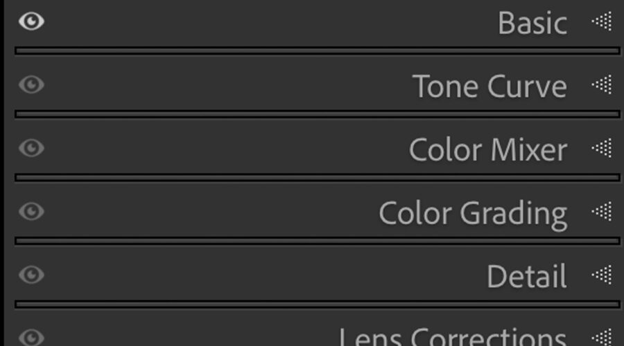
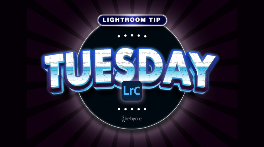
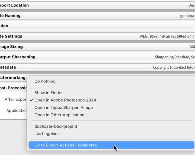
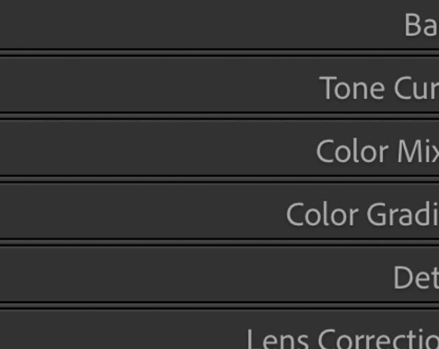
This is how to use one very powerful slider in Lightroom’s Detail panel to apply sharpening just to your subject’s detail areas (eyes, eyebrows, lips, ...