
Tip For Seeing a Better Color Preview in Lightroom’s Split Toning Panel
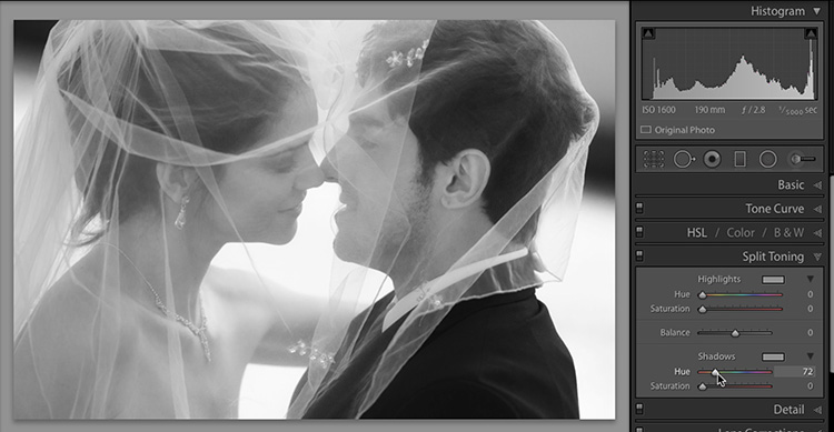
As excited as I am that it’s Photoshop World Conference week (awwwwww, yeah!), I’ve got some tips to share, so let’s get to it. This one is for when you’re using the Split Toning panel. The problem is that when you drag the Hue slider (as shown above, on the image I’ve already converted to black and white), you don’t’ see any color whatsoever. If you increase the amount of Saturation to where you want it, the color is so subtle that it’s hard to clearly see which Hue you are choosing. That’s what this tip is about — how to clearly see the Hue color as you drag, without cranking the Saturation slider up to +100, and then later having to adjust it back down.
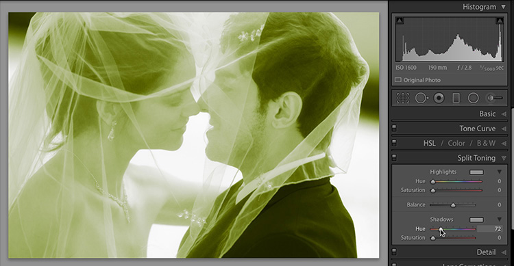
STEP ONE: Simply hold the Option key (PC: Alt-key) as you drag the Hue slider and Lightroom treats it as if you set the Saturation amount at +100, so you can clearly see the Hues clearly at full strength as you drag the slider, and in this case you can clearly see that green isn’t the color you’re looking for. 😉
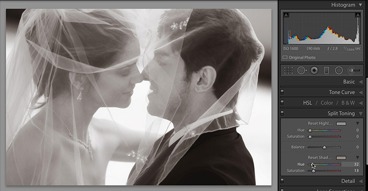
STEP TWO: When you’ve found the Hue you’re looking for (ahh, that’s more like it), simply let go of the Option key (PC: Alt key), and you can dial in the right amount of Saturation, knowing you’ve got the Hue right on the money.
Hope you found that helpful!
It’s Photoshop World Week!
I am so looking forward to meeting a bunch of you this week. The Pre-Conference Workshops start Wednesday, and the conference starts with the opening Adobe keynote at 9am on Thursday. We’ll be streaming the keynote live, and you can get the link Thursday morning from any of our social media sites.
Have a butt-kickin’, boot-scootin’, slap-happy Monday, and we’ll catch at back here tomorrow for “Lightroom Coffee Break.”
Best,
-Scott